My Run Results
Modernising Ireland's home for race results
MyRunResults is Ireland's primary platform for race results and event management — runners searching for times and personal records, event organisers running registration, timing and comms all in one place. As the customer base grew, the platform's navigation hadn't kept pace: finding a specific race, checking results, or browsing events had become genuinely difficult, and the visual identity felt outdated and no longer matched where the client wanted the brand to go.
I led the UX and UI design of the revamped website, directing a team of designers and working closely with developers to simplify the experience and establish a new visual identity, as part of a wider platform and brand relaunch.
Before


The Challenge
As MyRunResults' user base grew, navigation hadn't scaled with it. Finding a specific race, checking results, or getting from browsing to registration had become unnecessarily difficult. The information architecture reflected how the product had grown feature by feature, not how customers actually looked for things. On top of that, the visual identity had fallen behind: it read as dated and generic, and no longer matched the brand direction the client wanted to move toward.
The Approach
I led the UX and UI design end to end, directing a team of designers and working closely with developers to rebuild the site's information architecture around the two things customers actually came to do: find race results and discover new races to enter.
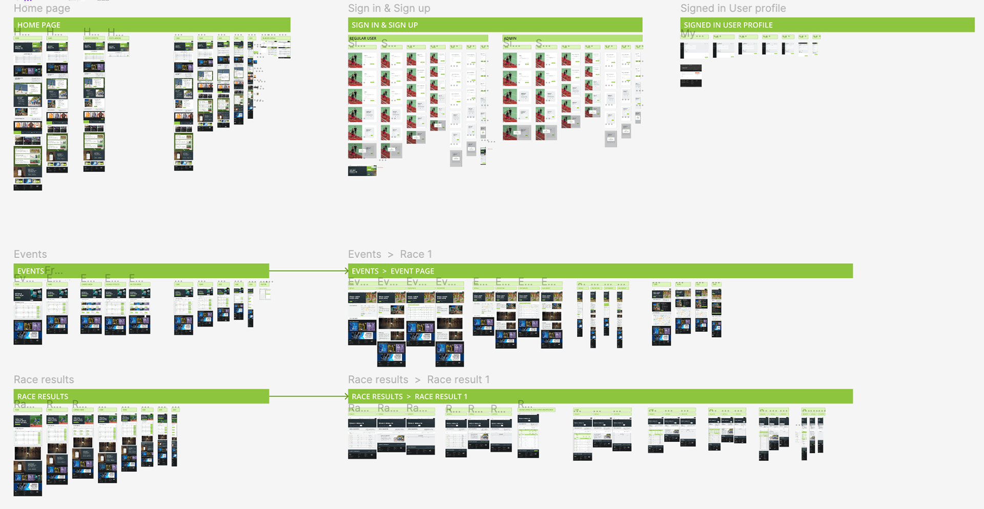
Early structural wireframes locked in a simplified navigation and content hierarchy before any visual design began, cutting the layers of clicks it previously took to get from the homepage to a specific result or event. Mid-fidelity wireframes extended that thinking across the platform's more complex surfaces — results tables, event listings, live race status, and an admin sign-in flow for organisers managing their own events.
Alongside the UX work, I led the visual refresh — moving from a dated, low-contrast look to a bolder navy-and-green identity designed to feel more energetic and more trustworthy at the same time, better matching the client's ambitions for the brand. A custom icon set was built to support dense, real-time race data — timing, pacing, tracking, leaderboards — without the interface feeling cluttered.
The redesign extended into a companion mobile app, giving runners live tracking, race maps and results on race day itself, not just after the fact.


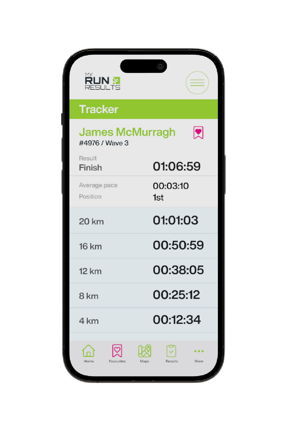
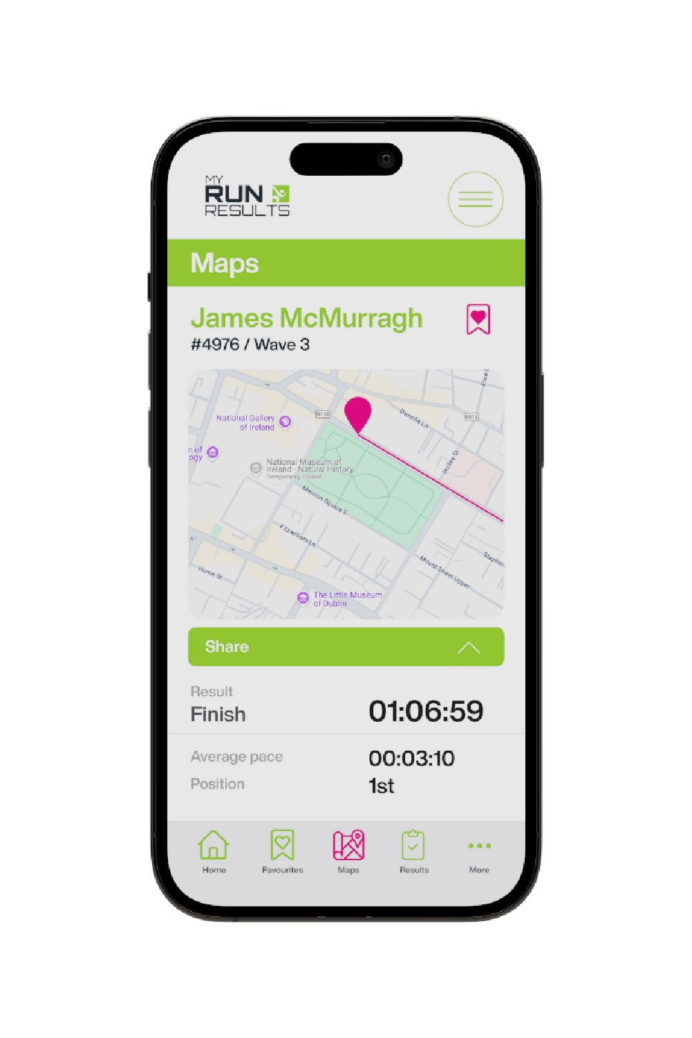
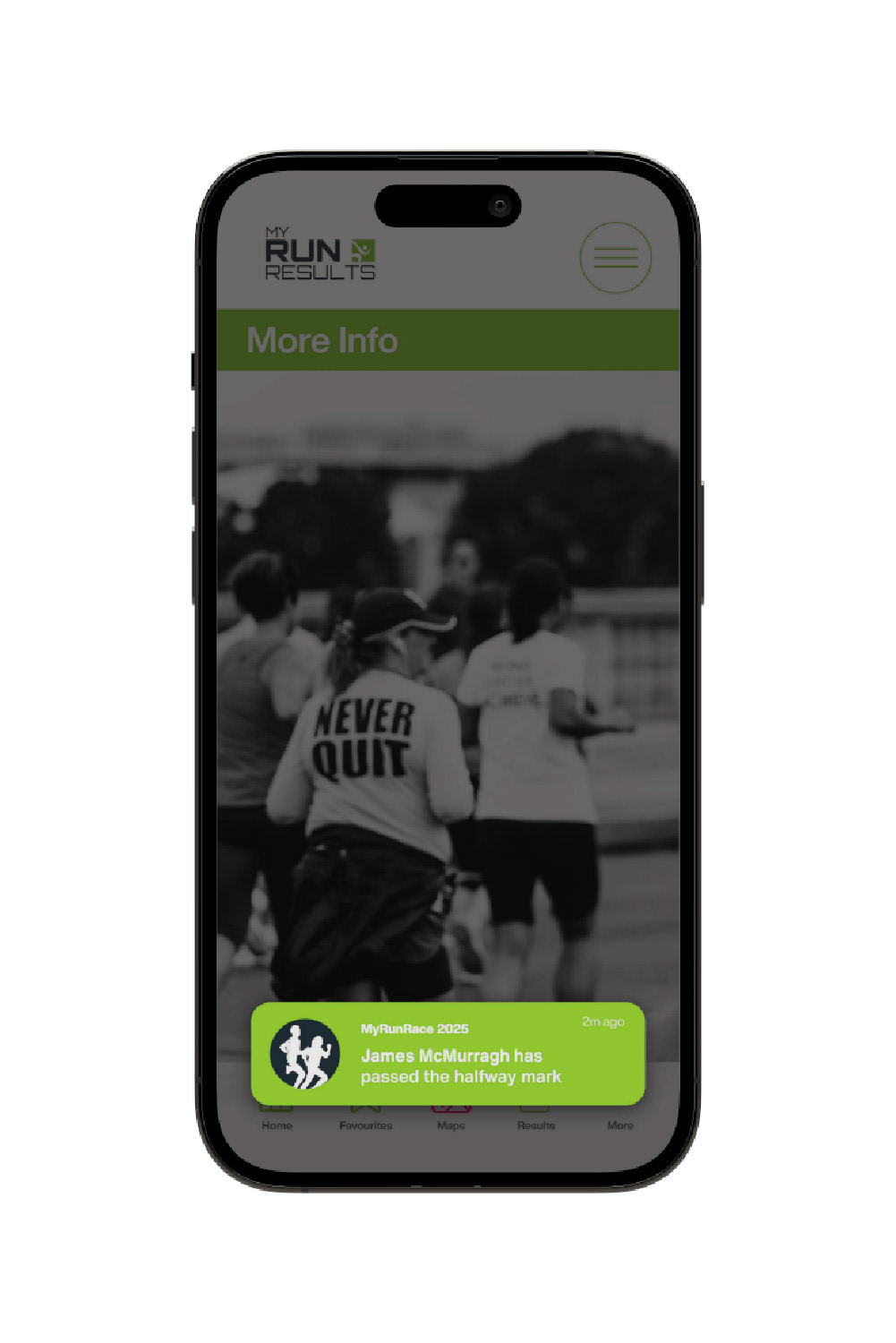
Screenshot of Figma prototype screens
Outcomes
Following launch, average task completion time decreased by approximately 20%, and 30-day user retention increased by approximately 15%, based on site manager reporting.
What I Learnt
Leading both the UX and the visual identity work on the same project meant navigation and brand couldn't be solved separately. Simplifying how customers found a race only worked because the new visual hierarchy made the simplified structure easy to scan at a glance. Directing a team through that meant keeping structural decisions (what content leads, what's cut) settled before visual style decisions began, so the two didn't end up pulling against each other mid-project.